|
Monday, 3 January 2022
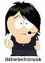
quote [ This little rabbit went to market. ]
They're made of shapes and curvy lines
|
Arravis said @ 7:43pm GMT on 4th January
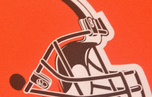
As a graphic designer that specializes in logos, I can tell you that this is purely a negative space issue. The highly cropped version in the TV banner doesn't give enough visual context. The entire logo, without being so severely cropped, works fine: https://editorial.designtaxi.com/images/Cleveland-Browns-Logo-Rabbit-2-1640594110.jpeg
Arravis said @ 7:44pm GMT on 4th January
As a graphic designer that specializes in logos, I can tell you that this is purely a negative space issue. The highly cropped version in the TV banner doesn't give enough visual context. The entire logo, without being so severely cropped, works fine:
Arravis said @ 7:44pm GMT on 4th January
As a graphic designer that specializes in logos, I can tell you that this is purely a negative space issue. The highly cropped version in the TV banner doesn't give enough visual context. The entire logo, without being so severely cropped, works fine: https://editorial.designtaxi.com/images/Cleveland-Browns-Logo-Rabbit-2-1640594110.jpeg
<-- Entry / Current Comment
Arravis said @ 7:43pm GMT on 4th January
As a graphic designer that specializes in logos, I can tell you that this is purely a negative space issue. The highly cropped version in the TV banner doesn't give enough visual context. The entire logo, without being so severely cropped, works fine: https://editorial.designtaxi.com/images/Cleveland-Browns-Logo-Rabbit-2-1640594110.jpeg